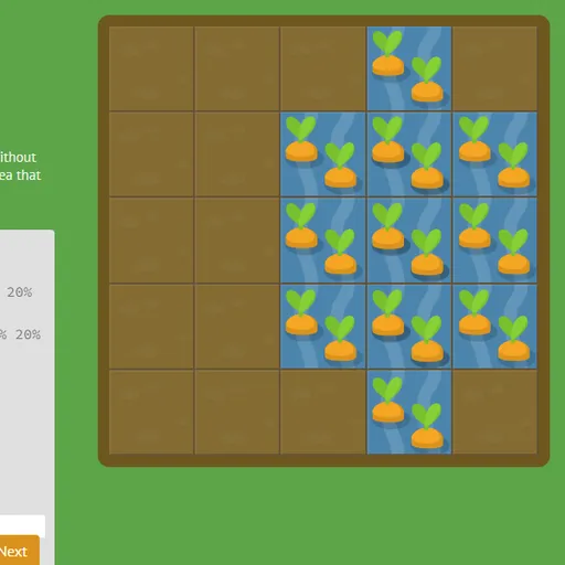
CSS Grid Carrot Patch is a coding puzzle that teaches CSS grid layout using a small vegetable plot. The garden is a five-by-five grid, and some squares hold carrots or weeds. You write real CSS to place a patch of water over carrots or poison over weeds. Since the garden is a live grid container, the patch shifts as you type, which makes grid lines easy to picture.
The Goal
Cover the right plants with the right treatment on every level. Water must land exactly on the carrots and poison exactly on the weeds, matching their size and position. When the patch fits, the Next button lights up and the plants change to show they are done.
How a Round Plays Out
Each of the 28 levels shows a lesson, a code box and the garden. Most of the stylesheet is already there, and you fill in the missing lines. Any correct code counts, even if it differs from the hint.
- Early levels use grid-column-start and grid-column-end to place the water.
- Next you learn negative line numbers and the span keyword.
- The grid-column and grid-row shorthands then combine start and end.
- Grid-area sets all four lines at once, and some levels have two overlapping patches.
- The order property rearranges items placed automatically.
- The final levels change the grid itself with grid-template-columns, grid-template-rows and grid-template, using percentages, pixels, repeat and fr units.
Keys and Buttons for CSS Grid Carrot Patch
| What you do | ⌨ Keyboard | 🖱 Mouse | 👆 Touch |
|---|---|---|---|
| Type CSS | Type in the code box | — | Tap the code box and use the on-screen keyboard |
| Submit a correct answer | Enter on the last line, or Ctrl + Enter | Click "Next" once it lights up | Tap "Next" |
| Pick a level | — | Click the level counter, then a level number, or use the side arrows | Tap the level counter, then a level number |
| Read about a property | — | Point at a highlighted property name in the instructions | — |
Winning Strategies
- Count lines, not cells. Covering columns 2 through 4 means running from line 2 to line 5.
- Reach for span when you know the width. Span 3 covers three cells from wherever the patch begins.
- Learn the grid-area order. It goes row start, column start, row end, column end, which is not the margin order.
- Let fr split the rest. Fixed sizes come first, then fr units share whatever space is left.
- Point at highlighted words. Property names in the lesson show the values they accept.
Handy Details
- On narrow screens the garden and editor stack, so tablets work, but property tips are easiest with a mouse.
- You can pick any level from the level counter menu.
- Ctrl and Enter submits a correct answer from the keyboard.
Who Should Play It
This is a great fit for students, junior developers and designers who want to understand CSS grid without reading a long spec. If you enjoy coding puzzles or hands-on layout tutorials, the garden makes each property feel concrete.
Played and checked by the KBHX Games team · updated